


Transform Your Space: Bold Color Schemes for the Contemporary South African Home
Discover the Richness: Exploring the Popularity of Jewel Tone Palettes
The Allure of Jewel Tones in Interior Design
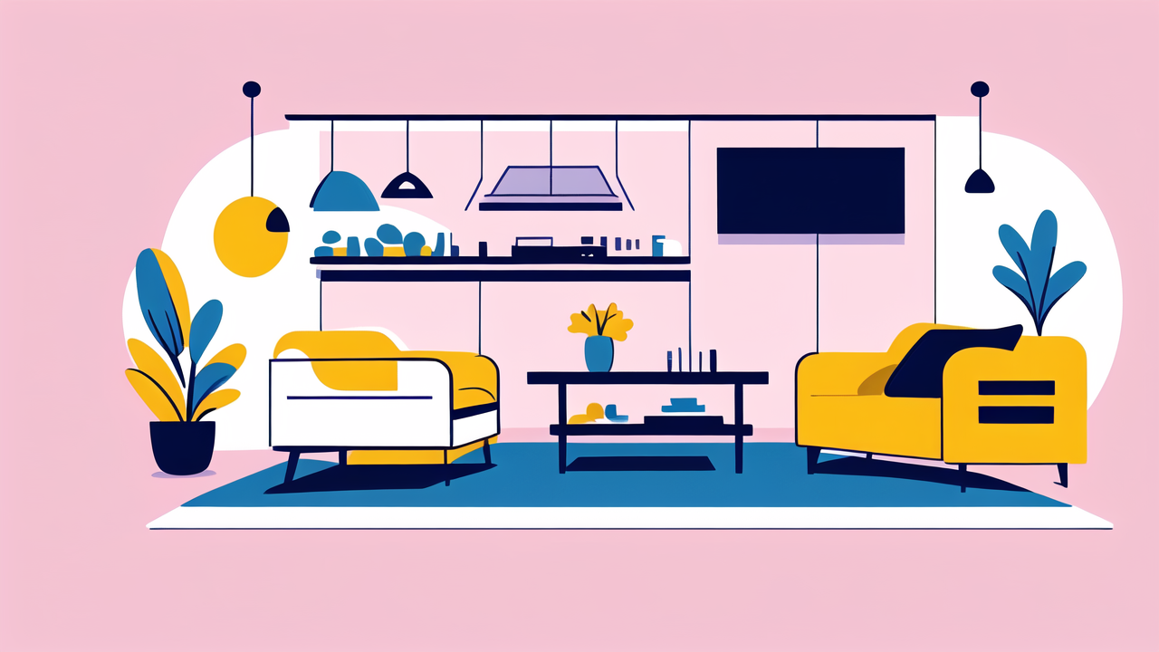
Jewel tones are making a big splash in South African interior design. These rich, deep colors bring warmth and luxury to any space. Think of deep emerald greens, sapphire blues, and ruby reds. They add depth and character to rooms.

Jewel tones create a cozy and inviting atmosphere. They also add a touch of glamour to spaces. These colors work well in both modern and traditional homes. They can make a small room feel larger and more interesting.
Many people are drawn to jewel tones for their versatility. They can be used as accent colors or as the main color scheme. Jewel tones also pair well with neutral colors like white, beige, or gray. This makes them easy to incorporate into existing decor.
How Jewel Tones Can Elevate Your Home Decor
Jewel tones can transform a dull room into a vibrant space. They add instant sophistication and drama. Here's how they can elevate your home decor:
- Create focal points: Use jewel tones on an accent wall or key piece of furniture.
- Add depth: Deep colors can make rooms feel more spacious and layered.
- Boost mood: Rich colors can create a positive atmosphere in your home.
- Highlight features: Use jewel tones to draw attention to architectural details.
- Complement artwork: These colors provide a perfect backdrop for displaying art.
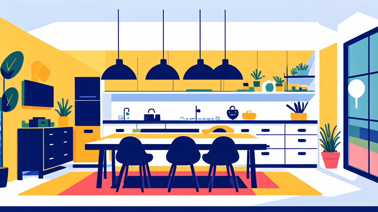
Jewel tones also work well with natural materials like wood and stone. This makes them ideal for South African homes that often feature these elements. They can help bring the beauty of nature indoors.
The Impact of Color Trends on South African Homeowners
Why Jewel Tones Are the Rage in South Africa
Jewel tones are becoming very popular in South African homes. There are several reasons for this trend. First, these colors reflect the natural beauty of South Africa. They mirror the deep blues of the ocean and the rich greens of the forests.
Second, South Africans love bold, expressive design. Jewel tones allow homeowners to make a statement with their decor. They can show their personality through color choices. This is a move away from safer, neutral color schemes.
Lastly, jewel tones are versatile. They can be used in small doses or as the main color scheme. This flexibility appeals to many South African homeowners. They can experiment with color without changing everything in their home.
Embracing Cultural Vibrancy with Jewel Tones
Jewel tones connect well with South Africa's vibrant culture. They echo the bright colors seen in traditional African art and textiles. By using these colors, homeowners can celebrate their heritage in a modern way.
These colors also reflect South Africa's diversity. Just as the country is a rainbow nation, jewel tones offer a range of hues. This allows for creative mixing and matching in home decor. It's a way to represent the rich tapestry of South African culture.
Jewel tones can also add a sense of luxury to homes. In a country where many are improving their living spaces, these rich colors offer an affordable way to add opulence. They can make even simple spaces feel more elegant and sophisticated.
Taking Action: Incorporating Jewel Tones into Your Space
Tips on Choosing the Right Jewel Tone for Your Home
Picking the perfect jewel tone for your home can be fun. Here are some tips to help you choose:
- Think about the mood you want. Blue can be calming, while red can be energizing.
- Consider your existing decor. Choose a tone that works with your furniture and accessories.
- Look at the light in your room. Darker rooms may benefit from lighter jewel tones.
- Start small. Try jewel-toned accessories before painting entire walls.
- Use color psychology. Different colors can create different feelings in a space.
Remember, there's no wrong choice. The best jewel tone is one that makes you happy in your space. Don't be afraid to try different shades until you find what you love. You can always change it if you want to try something new later.
The Future of Home Decor: Trends to Watch
As jewel tones become more popular in South African homes, new trends are emerging:
- Mixing jewel tones: Combining different jewel tones in one space for a bold look.
- Jewel-toned kitchens: Moving beyond white kitchens to ones with colorful cabinets.
- Textured jewel tones: Using these colors in velvet, silk, and other luxurious fabrics.
- Jewel-toned outdoor spaces: Bringing these rich hues to patios and gardens.
- Eco-friendly jewel tones: Using natural, sustainable materials in these deep colors.
As South African homeowners become more confident with color, we'll see more creative uses of jewel tones. The future of home decor in South Africa is looking bright and bold. It's an exciting time for those who love color and want to make their homes truly unique.